Choosing Brand Colors That Resonate With Global Property Buyers
Reading time: 9 minutes
Table of Contents
- Why Color Strategy Makes or Breaks Global Real Estate Brands
- The Psychology Behind Property Buying Decisions
- Regional Color Preferences You Can’t Ignore
- Case Studies: Brands That Got It Right (and Wrong)
- A Practical Framework for Choosing Your Palette
- Common Challenges and How to Solve Them
- Frequently Asked Questions
Why Color Strategy Makes or Breaks Global Real Estate Brands
Ever scrolled through a property listing site and felt an instant sense of trust—or unease—before reading a single word? That’s color doing its job. In 2026, with over 68% of international property inquiries starting on a mobile screen according to recent Knight Frank Wealth Report data, your brand’s color palette often communicates value, security, and prestige faster than any headline copy could.
Here’s the straight talk: choosing brand colors for a global property portfolio isn’t about picking what looks pretty in a boardroom in London or New York. It’s about strategic navigation across radically different cultural associations. A color that signals “luxury and calm” in Scandinavia might read as “cold and unwelcoming” in Dubai. Get this wrong, and you’re not just losing aesthetic appeal—you’re losing conversions from buyers who never even schedule a viewing.
Real estate branding agencies now report that developers marketing across three or more regions see up to a 22% variance in engagement rates purely based on how well their visual identity aligns with local color psychology. That’s not a rounding error. That’s a pipeline of missed leads.
The Psychology Behind Property Buying Decisions
Property purchases are among the most emotionally charged transactions a person makes. Unlike buying a pair of shoes, buyers are committing life savings, family futures, and sometimes citizenship-by-investment ambitions to a single decision. Color taps directly into that emotional undercurrent before logic even kicks in.
Trust, Status, and Belonging
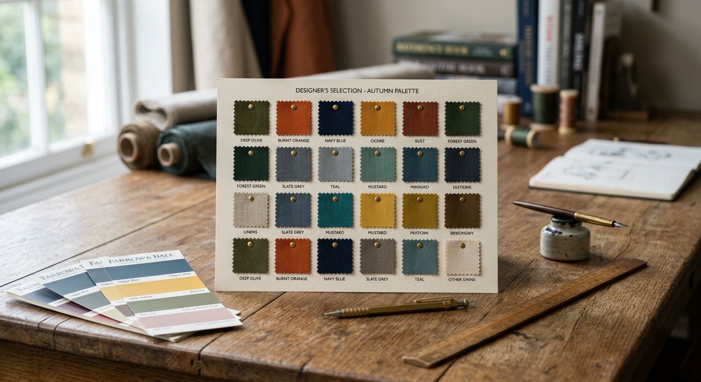
Global buyers—whether they’re relocating executives, second-home seekers, or diaspora investors—are subconsciously scanning for three signals: Is this trustworthy? Does this reflect my status? Will I belong here? Navy blues and deep greens consistently test well for “trustworthy,” gold and black accents for “status,” and warm terracotta or sand tones for “belonging” in Mediterranean and Middle Eastern markets.
The Speed of First Impressions
Research from color psychology studies frequently cited in branding literature suggests people form a color-based judgment about a brand within 90 seconds, and up to 90% of that snap judgment is based on color alone. For property developers spending six or seven figures on marketing campaigns, that 90-second window is either your best sales tool or your biggest liability.
Regional Color Preferences You Can’t Ignore
Quick scenario: imagine you’re launching a beachfront residential tower and marketing it simultaneously to buyers in Singapore, Riyadh, and Miami. What color strategy survives all three audiences without diluting your brand? Let’s dive into what actually moves the needle by region.
- East Asia (China, Singapore, South Korea): Red symbolizes prosperity and good fortune, making it popular for launch events, but gold paired with deep red communicates premium status without feeling garish.
- Middle East (UAE, Saudi Arabia, Qatar): Gold, deep teal, and sand tones dominate luxury developments. Green carries strong positive religious and cultural resonance, while overly stark white can feel clinical rather than aspirational.
- North America (US, Canada): Navy, charcoal, and muted greens signal reliability and old-money stability, especially in coastal and suburban luxury markets.
- Western Europe (UK, France, Germany): Understated palettes—soft grays, deep forest green, muted burgundy—perform well, reflecting a cultural preference for restrained elegance over flash.
- South Asia (India): Warmer, richer tones including maroon, gold, and saffron connect emotionally, particularly for NRI (Non-Resident Indian) buyers seeking a sense of heritage.
Case Studies: Brands That Got It Right (and Wrong)
Theory is useful, but nothing beats real examples. Here are three scenarios that illustrate how color strategy plays out in practice.
Case 1 — The Dubai Waterfront Misstep: A European developer launched a waterfront project in Dubai using the same cool-blue, minimalist Scandinavian branding that performed well in Copenhagen. Local market research firms later noted the campaign underperformed by nearly 30% against comparable launches, with focus groups describing the visuals as “sterile” and “not aspirational enough.” A rebrand incorporating warm gold accents and richer neutrals reportedly lifted inquiry rates significantly within two quarters.
Case 2 — The Singapore Success Story: A regional developer targeting both local and mainland Chinese buyers used a dual-tone identity: deep jade green (prosperity, growth) as the primary brand color with subtle gold detailing for premium unit tiers. This allowed one consistent brand system to resonate across two culturally distinct but overlapping buyer segments without needing a full rebrand for each market.
Case 3 — The US Sunbelt Rebrand: A Florida-based luxury condo brand shifted from a bright coral identity (originally chosen to evoke “beach lifestyle”) to a deeper terracotta and navy combination after buyer surveys revealed international investors—particularly from Latin America and Europe—associated the brighter tone with budget vacation rentals rather than premium ownership. The rebrand aligned better with the $2M+ price point they were targeting.
What These Cases Have in Common
In every case, the winning move wasn’t finding a “universally perfect” color—it was recognizing that color perception is contextual, tied to price positioning, and deeply intertwined with buyer aspiration, not just aesthetic taste.
A Practical Framework for Choosing Your Palette
Here’s a practical roadmap you can apply whether you’re branding a single boutique development or a multi-country portfolio:
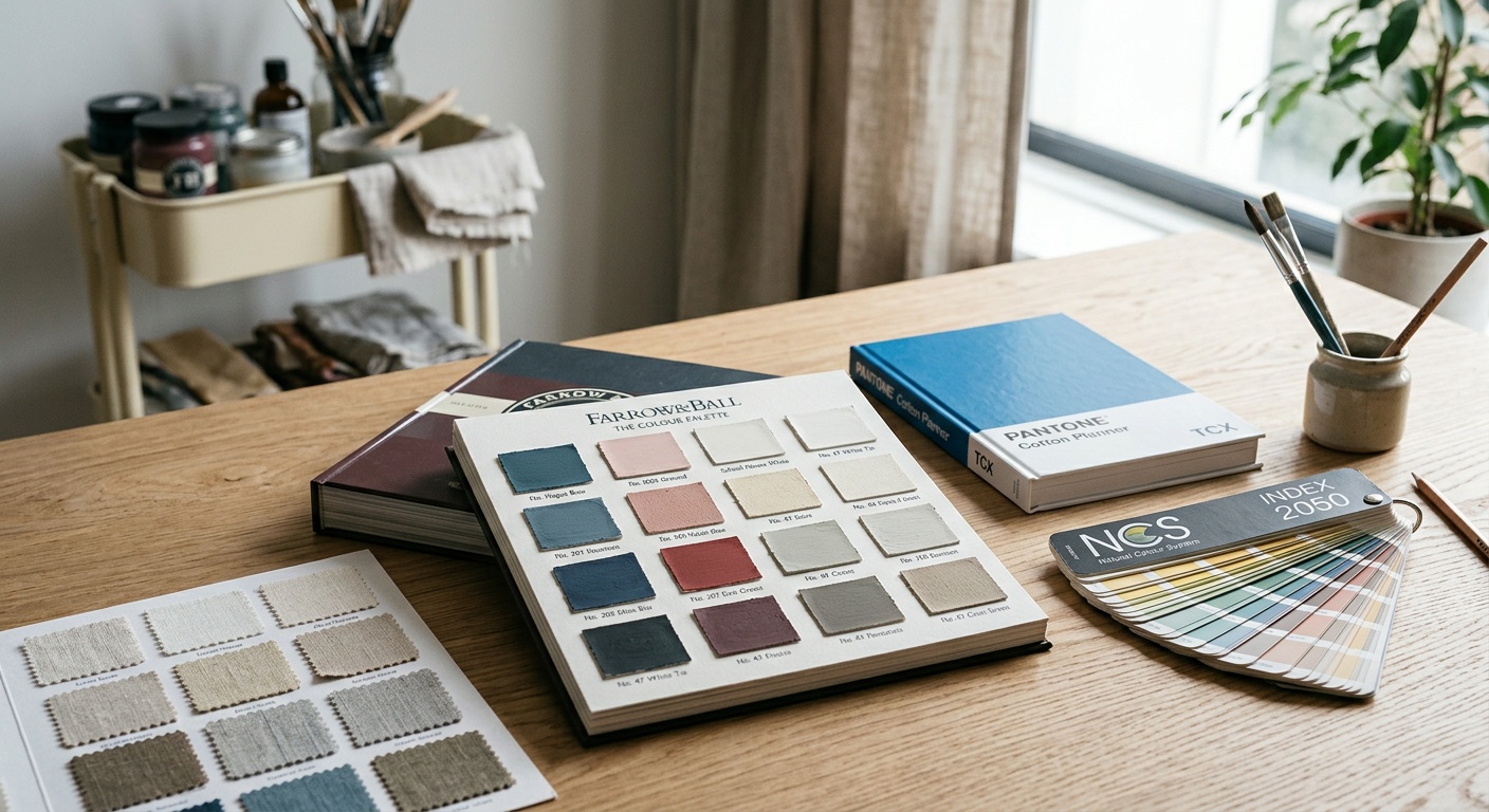
- Map your buyer personas by region first, colors second. Don’t start with mood boards—start with who is actually buying and what they associate with prestige in their home culture.
- Test with local focus groups, not headquarters opinions. A color that tests well in your home office rarely reflects on-the-ground sentiment abroad.
- Build a flexible core palette with regional accent variations. Keep one recognizable anchor color for global brand consistency, then allow secondary accent tones to shift by market.
- Audit competitor palettes in each target market. If every luxury competitor in a region uses gold and navy, blending in might actually cost you differentiation—sometimes a calculated contrast wins attention.
- Reassess annually as buyer demographics shift. Buyer pools in cities like Lisbon, Dubai, and Bali have shifted meaningfully year over year, and color resonance shifts with them.
Color Performance Comparison Across Key Markets
| Color | Middle East Appeal | East Asia Appeal | Western Europe Appeal | North America Appeal |
|---|---|---|---|---|
| Gold | Very High | High | Moderate | Moderate |
| Navy Blue | Moderate | Moderate | High | Very High |
| Deep Green | High | High | High | Moderate |
| Terracotta/Sand | Very High | Low | Moderate | High |
| Bright Coral | Low | Low | Low | Moderate |
Buyer Trust Score by Primary Brand Color (Survey-Based Index, 0–100)
Common Challenges and How to Solve Them
Well, here’s where most developers get stuck—and how to push through.
Challenge 1: Brand Consistency vs. Local Relevance. Marketing teams worry that adapting colors per region will fragment their global identity. Solution: anchor everything to one signature color (like a specific gold or deep green) used consistently in your logo, while allowing secondary palette elements—backgrounds, accent graphics, brochure trims—to flex regionally.
Challenge 2: Limited Local Market Data. Smaller developers rarely have budget for extensive color research in every target country. Solution: partner with local real estate marketing agencies for lightweight A/B testing on digital ad creatives before committing to print and signage, which are far more expensive to change.
Challenge 3: Internal Bias Toward “Global Aesthetic.” Leadership teams often default to what looks sophisticated in their home market. Solution: bring actual buyer feedback—not just internal design opinions—into final palette decisions, especially for developments explicitly targeting foreign investment.
Frequently Asked Questions
Does brand color really influence a property buying decision, or is it just aesthetics?
Color influences trust and perceived value before a buyer engages with pricing or floor plans. It won’t single-handedly close a sale, but it shapes whether a buyer clicks through, requests a brochure, or books a viewing—each a critical step in the funnel.
Should I use one global brand palette or different colors for each market?
A hybrid approach works best for most developers: keep one signature anchor color for global recognition and brand equity, while allowing secondary tones and accents to adapt regionally based on local buyer psychology.
How often should property brands revisit their color strategy?
Annually is a reasonable cadence, especially given how quickly buyer demographics shift in fast-growing markets. If you’re entering a new country or launching a new price tier, that’s also a natural trigger point to reassess your palette.
Your Roadmap Forward: Turning Color Strategy Into Sales Momentum
Choosing brand colors for global property buyers isn’t a design afterthought—it’s a strategic lever sitting right alongside pricing and location in your marketing arsenal. As cross-border property investment continues expanding through 2026 and beyond, developers who treat color as a data-informed decision, not a personal preference, will consistently outperform those who don’t.
- Start with buyer personas, not mood boards—know who you’re selling to before you pick a swatch.
- Test locally before locking in colors across expensive print and signage assets.
- Anchor globally, flex regionally to balance brand recognition with cultural resonance.
- Revisit annually, especially when entering new markets or price segments.
Pro Tip: The right color palette isn’t about avoiding cultural missteps—it’s about creating a visual language so aligned with your buyer’s aspirations that trust builds before they’ve read a single word of your listing. So, which market are you underestimating right now with the wrong palette?